A Deep Dive into the DHL Logo
A Deep Dive into the DHL Logo The DHL logo is more than just a visual representation; it's a symbol of global connectivity, speed, and reliability. Let's delve into the elements that make this logo so iconic.
A Deep Dive into the DHL Logo
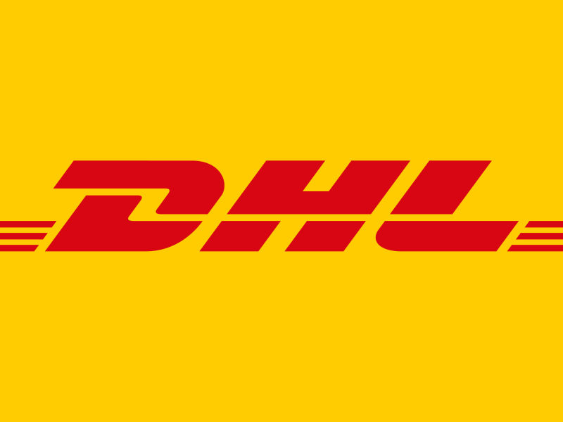
The DHL logo is more than just a visual representation; it's a symbol of global connectivity, speed, and reliability. Let's delve into the elements that make this logo so iconic.
The Evolution of the DHL Logo
The DHL logo has undergone several iterations since its inception, but the core elements and the overall message have remained consistent. Initially, the logo featured a more complex design with the letters of DHL styled individually within geometric shapes. Over time, the design has simplified, emphasizing the brand name and its association with speed and efficiency.
The Meaning Behind the Design
Yellow and Red: The dominant colors in the DHL logo are yellow and red. Yellow often signifies speed, optimism, and clarity, reflecting DHL's commitment to fast and reliable delivery services. Red is associated with energy, passion, and urgency, further emphasizing the company's dynamic nature.
Font and Typography: The bold and italicized font used for the DHL lettering conveys a sense of movement and direction. This visual cue reinforces the idea of global logistics and the company's ability to connect people and places.
Geometric Shapes: While the current logo is more minimalist, earlier versions incorporated geometric shapes that represented the various facets of the logistics industry. These shapes symbolized the interconnectedness of global trade and the precision required in the shipping process.
The Logo's Impact
The DHL logo has become synonymous with the company's brand identity. Its simple yet powerful design has contributed to DHL's recognition as a global leader in logistics. The logo's association with speed, reliability, and efficiency has helped the company build trust with customers around the world.
Key Takeaways
Simplicity and Clarity: The DHL logo effectively communicates the company's core values through a clean and uncluttered design.
Color Psychology: The use of yellow and red evokes strong emotional responses, reinforcing the brand's message.
Typography: The choice of font and typography adds a dynamic element to the logo, reflecting the company's fast-paced nature.
Global Recognition: The DHL logo is instantly recognizable, making it a powerful marketing tool.
Conclusion
The DHL logo is a testament to the power of effective design. Through its evolution, the logo has remained true to the company's core values and has become a symbol of global logistics. Its simplicity, combined with its powerful visual elements, has contributed to DHL's enduring success.
Would you like to know more about a specific aspect of the DHL logo, such as its history, design principles, or its role in the company's branding strategy?
Here are some additional topics you might find interesting:
A comparison of the DHL logo to other logistics company logos
The role of color theory in logo design
The impact of logo design on brand perception
Feel free to ask any questions you may have!
Logo Nasıl Tasarlanır? (2026 Rehberi)
Logo Tasarım Fiyatları: Güncel Ücretler, Paketler ve Doğru Seçim Rehberi

DİMES Yeni Logo ve Sloganını Tanıttı

Deepseek Logo Analysis: A Symbol of Innovation and Exploration

Comprehensive List of Countries and Their Names in Native Languages Along with 'Logo' Translation
The Leaping Deer: A Symbol of Strength and Reliability - Decoding the John Deere Logo

Twitter's New Logo: A Deep Dive into the "X"

A Deep Dive into TOGG's Symbolic Logo
A Siren's Song: Analyzing the Iconic Starbucks Logo
A Bull's Eye: Analyzing the Iconic Red Bull Logo
A Deep Dive into the Envato Logo

Torku Logo Analysis
