The Leaping Deer: A Symbol of Strength and Reliability - Decoding the John Deere Logo
The Leaping Deer: A Symbol of Strength and Reliability - Decoding the John Deere Logo The John Deere logo, featuring a leaping deer, is a familiar sight to anyone who has seen agricultural or construction equipment.
The Leaping Deer: A Symbol of Strength and Reliability - Decoding the John Deere Logo
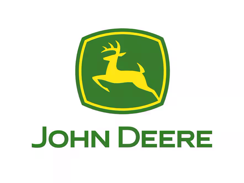
The John Deere logo, featuring a leaping deer, is a familiar sight to anyone who has seen agricultural or construction equipment. But have you ever stopped to consider the story behind this iconic emblem? The logo's evolution reflects the company's growth from a small blacksmith shop to a global leader in its industry.
From Plows to a Brand
John Deere, the man, was a blacksmith who, in 1837, designed a steel plow that was much more effective for the tough prairie soils of the American Midwest than the cast-iron plows of the time. This innovation laid the foundation for the company that bears his name.
Early Logos and the Deer's Arrival
Initially, John Deere didn't have a standardized logo. Early branding efforts included various depictions of deer, often with different species and poses. The first recorded use of a deer image was in 1876, almost 40 years after the company's founding. This early logo featured a standing deer, which was quite different from the leaping deer we know today.
The Leaping Deer Takes Center Stage
The iconic leaping deer logo we recognize today began to take shape in the early 20th century. The deer species was standardized as the white-tailed deer, native to North America. The pose of the deer evolved into a dynamic leap, conveying a sense of energy, strength, and forward motion. This change coincided with the company's expansion into tractors and other agricultural machinery.
Evolution and Modernization
Like many long-standing brands, the John Deere logo has undergone several updates over the decades to keep it fresh and relevant. These changes have been subtle, focusing on refining the deer's silhouette, simplifying the design, and updating the typeface used for the "John Deere" wordmark.
Early 1900s: The leaping deer starts to become prominent.
Mid-1900s: More stylized and streamlined versions of the deer are introduced.
Late 1900s and 2000s: Further refinements to the deer and the wordmark, with a focus on clean lines and a modern look.
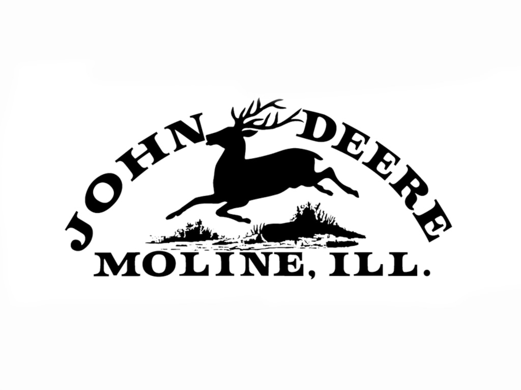
1876
The first trademark using the leaping deer was registered in 1876, although registration papers indicated the mark had been in use for three years. John Deere was well established in Moline by this time. The company was producing more than 60,000 plows a year, which were commonly referred to as ‘Moline plows’ because of the factory location. Obviously, there was a need for an official registered trademark. An official trademark was also the only protection against copying and deception.
This trademark shows a deer bounding over a log. The type of deer, or whether it is simply an artist representation of a deer, is unknown. The native North American white-tailed deer is portrayed in future trademarks.
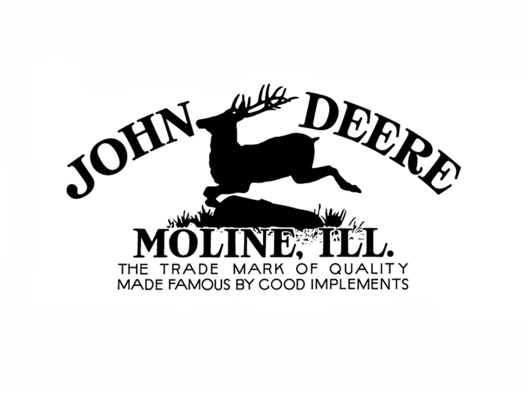
1912
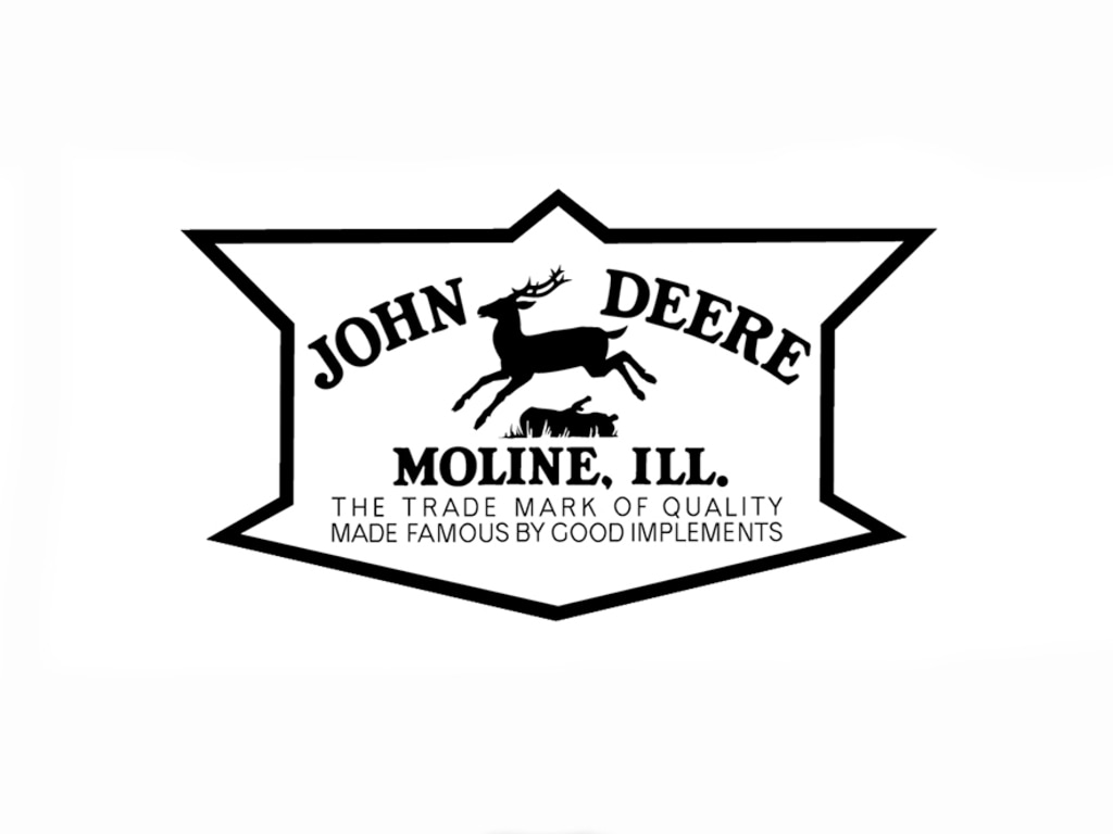
The second version of the John Deere trademark was being used by 1910 and registered in 1912. The deer again was shown leaping over a log. However, there was more detail and definition this time. The slogan "The Trade Mark of Quality Made Famous by Good Implements" first appears here, extending across the bottom.
1936
In 1936, the company's standardization committee saw a need to "better adapt the trademark for stenciling on products." In response, the deer became a solid silhouette removing all the detail from the previous artwork. This change, combined with the outstretched legs, provided a stronger, more recognizable profile.
A 12-sided border was added around the leaping deer, and the antlers were changed slightly. The words, "John Deere, Moline, Ill." remained in the same position but were made somewhat bolder. The slogan below it was unchanged.
1937
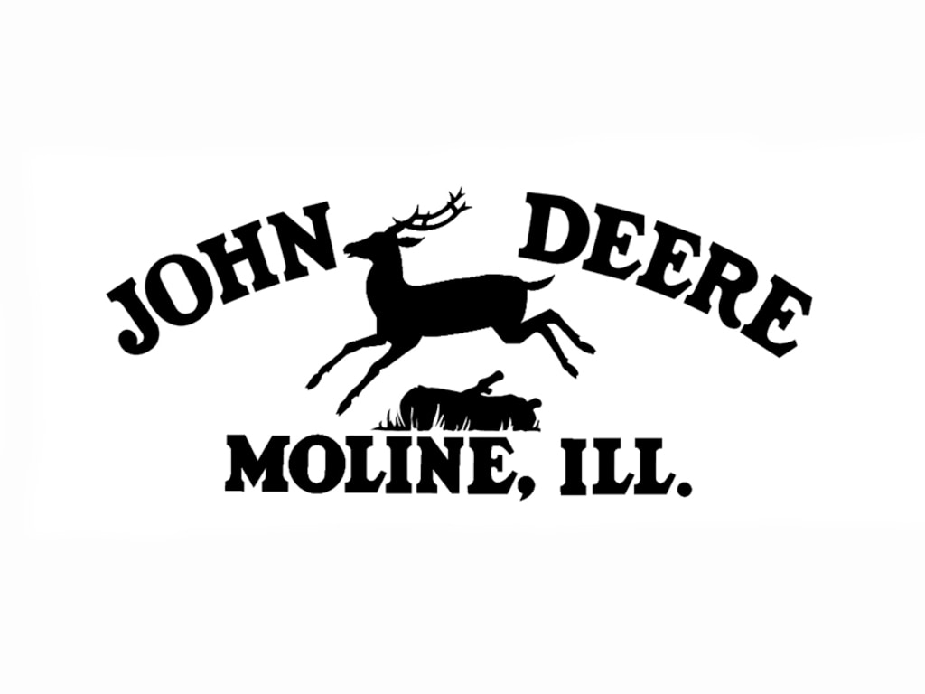
In 1937, another updated trademark was registered. This one, even simpler. The typography and leaping deer remained, but the border disappeared. John Deere was offering more products than ever before. There were now more places to use the trademark, which may have prompted the update. The fact that 1937 marked the company's centennial could have been another factor in the change.
1950
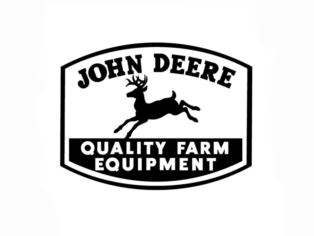
This update was a breakthrough in many respects when it first appeared in 1940. First, the deer’s antlers were turned forward. Its tail was pointed upward to resemble the white-tailed deer. And it was no longer bounding over a log. The words "John Deere," now in a bolder square-serif font, were raised over the top of the deer’s head and antlers. A new slogan - "Quality Farm Equipment" was set in a bold sans serif typeface and reversed out of the ground beneath the deer. The words "Moline, Ill." were also dropped -- a change long overdue since John Deere was increasing its reach throughout the world. The surrounding border was modified, becoming a four-sided shape with flat sides and curves top and bottom to unify and contain the elements of the trademark.
1956
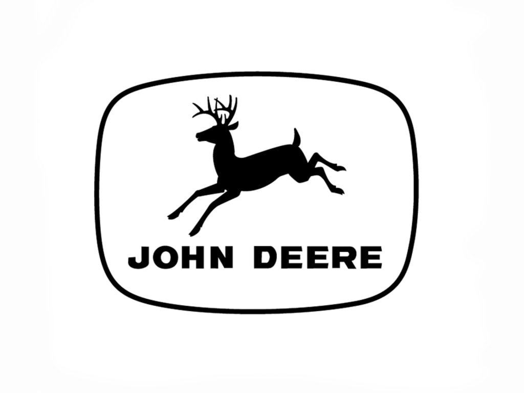
The 1956 version of the trademark, which was registered in 1962, represented yet again the call for a simpler design. The slogan "Quality Farm Equipment" was dropped. By then, John Deere was established in the construction equipment industry, and contractors and loggers became familiar with yellow and black machines bearing the symbol. A radius was given to the corners of the border, and a slight curve was added to all four sides of the ellipse. The words "John Deere" were placed below the leaping deer for the first time. The deer itself was left relatively unchanged: legs extended, antlers forward.
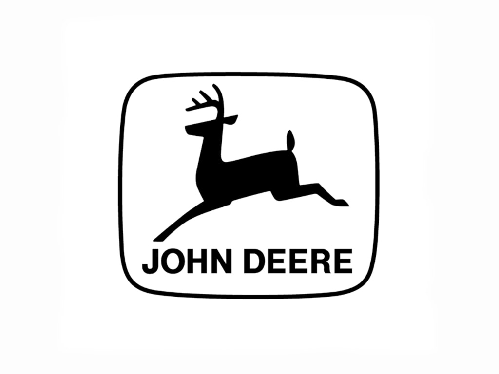
1968
A clean-cut, contemporary look marked the revision in 1968. A company memo noted, "the new trademark is in keeping with the progress being made throughout all divisions of the Company... it provides for better reproduction and greater readability under a wider range of usage." The deer image was streamlined to show a straight-side silhouette with just two legs, instead of the four, and one four-point rack of antlers. The "John Deere" logotype was changed using a hand-modified version based on the Helvetica font. The width of the ellipse border was narrowed, and the size of the deer inside it was increased.
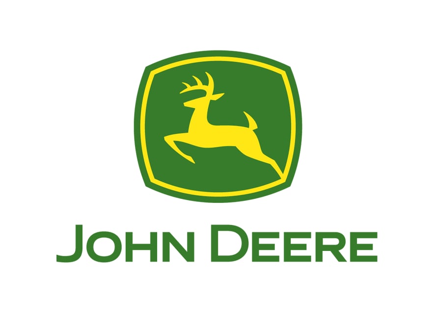
2000
In 2000, John Deere unveiled the latest evolution in the trademark. This updated mark is true to the strong John Deere heritage. Yet, its sharpened antlers, angles, muscularity and attitude give the trademark an energized and dynamic edge. John Deere’s logo, after being known for decades as the "leaping deer,” for the first time is actually leaping upward instead of landing.
Throughout the years, refinements to the trademarks have reflected what the company was about at that point in time and what it saw as important to its future. The current version illustrates John Deere's determination to stay focused on being the premier company in its industries worldwide, while remaining firmly rooted in its basic values of integrity, quality, humanity, commitment, and innovation.
Logo Nasıl Tasarlanır? (2026 Rehberi)

Logo Tasarım Fiyatları: Güncel Ücretler, Paketler ve Doğru Seçim Rehberi

DİMES Yeni Logo ve Sloganını Tanıttı

Deepseek Logo Analysis: A Symbol of Innovation and Exploration

Comprehensive List of Countries and Their Names in Native Languages Along with 'Logo' Translation

Twitter's New Logo: A Deep Dive into the "X"

A Deep Dive into TOGG's Symbolic Logo

A Siren's Song: Analyzing the Iconic Starbucks Logo
A Bull's Eye: Analyzing the Iconic Red Bull Logo
A Deep Dive into the Envato Logo

A Deep Dive into the DHL Logo
Torku Logo Analysis
