Renault Logo
Renault Logo PNG vector in SVG, PDF, AI,vectors format
Renault Logo: A Brief Overview
Evolution of the Logo: The Renault logo has undergone several transformations throughout its history. Initially, it featured the Renault brothers' initials. Over time, it evolved into the iconic diamond shape (or "losange" in French) we recognize today.
The Diamond Shape: The diamond shape was first introduced in 1925 and has become synonymous with the brand. It was chosen for its strong geometric form and its ability to be easily integrated into car grilles.
Modernization: In recent years, Renault has modernized its logo, opting for a flatter, more streamlined design. This reflects the brand's focus on innovation and its forward-looking approach. The latest iteration, introduced in 2021, is a revival of the 1972 logo, simplified and modernized. It signifies the brand's return to its roots while embracing a contemporary aesthetic.
Symbolism: The diamond shape is seen as representing dynamism, progress, and modernity. It's a simple yet memorable symbol that has helped establish Renault as a global automotive brand.
Company Information
Country of Origin: France (Fransa)
Sector (Website Category): Automotive (Otomotiv) / Transportation (Ulaşım)
Keywords: Renault, logo, diamond, losange, France, automotive, cars, vehicles, brand identity, history, design, transportation (Renault, logo, elmas, losanj, Fransa, otomotiv, arabalar, taşıtlar, marka kimliği, tarih, tasarım, ulaşım)
Recommended for you
Özkal Makine
Fema Teknik Lazer
Walmak Makine Metal Sanayi
Akdenizler Lazer Kesim
Yeşil Makina Logo
Özdemir Demir Doğrama
Karabulut Metal
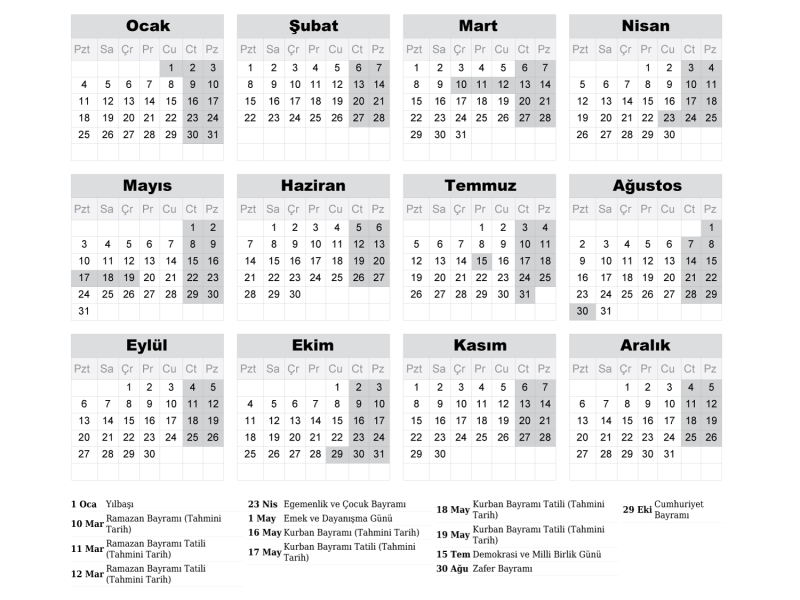
2027 Takvimi İndir: PDF & AI Format (CMYK Baskı Uyumlu)
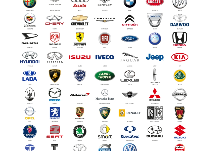
Araba Logoları: Tüm Araç Markaları Logo Koleksiyonu
Akcan Metal: Lazer Kesim ve Büküm Hizmetleri

Dilde Bıldırcın Karaman: Lezzetli Bıldırcın Ürünleri
