Motul Logo
Motul Logo PNG vector in SVG, PDF, AI,vectors format
Let's analyze the Motul logo in English. Here's a concise overview:
Wordmark Focus: The Motul logo is primarily a wordmark, meaning it focuses on the company name itself. The word "Motul" is written in a distinctive, custom typeface.
Unique Typography: The most notable feature is the stylized "O" and "T." The top bar of the "T" extends significantly to the left, overlapping and "biting" into the "O." This creates a unique visual element and makes the logo instantly recognizable. Some interpret this as symbolizing innovation and a forward-thinking approach.
Bold and Strong: The font used for the wordmark is generally bold and strong, conveying a sense of reliability, durability, and high performance, which are important qualities for a lubricant brand.
Color Palette: The classic Motul logo uses a bright red background, often associated with energy, passion, and high performance. The "Motul" wordmark is typically in white or black, providing strong contrast and good readability.
Simplicity and Memorability: Despite the unique "O" and "T" connection, the logo is relatively simple and easy to remember. This simplicity contributes to its effectiveness in branding and advertising.
Association with Motorsports: Motul is heavily involved in motorsports, and the logo has become closely associated with racing and high-performance engines. This association reinforces the brand's image of quality and reliability.
Evolution (Subtle): The core design of the Motul logo has remained largely consistent over the years, though there have been minor refinements to the typeface and spacing. This consistency has helped to build strong brand recognition.
Where to Find the Logo: Official, high-resolution versions of the Motul logo should be obtained from the company's official website or press resources. However, you can often find various versions of the logo on websites like LogoKi (You can download various versions of the Motul logo from websites like logoki.com which provides various formats for different uses.) or similar logo archives. While these sites can be convenient for quick access, always prioritize official sources for the best quality and to ensure correct usage.
In summary, the Motul logo is a well-designed wordmark that effectively communicates the brand's values of performance, reliability, and innovation. The distinctive "O" and "T" connection makes it a highly recognizable symbol in the automotive and motorsports world.
Recommended for you
Karabulut Metal
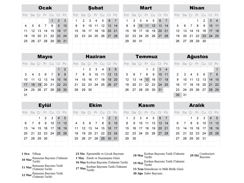
2027 Takvimi İndir: PDF & AI Format (CMYK Baskı Uyumlu)
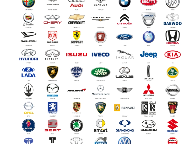
Araba Logoları: Tüm Araç Markaları Logo Koleksiyonu
Akcan Metal: Lazer Kesim ve Büküm Hizmetleri

Dilde Bıldırcın Karaman: Lezzetli Bıldırcın Ürünleri
Aslan Danışmanlık: İsa Başer ile İşletme Danışmanlığı
Ege Elektrik Aydın Ören: Bobinaj ve Motor Tamiri
Gazi Sondaj Gaziantep: Kuyu Kazı ve Sondaj Hizmetleri
Jet Lazer Metal: Lazer Kesim ve Metal İmalat Hizmetleri
Hazel Grup Elektromekanik: Lazer Kesim ve Metal İşleme
Deveciler Metal: Sac İşleme ve Lazer Kesim Hizmetleri
