Microsoft Sharepoint Logo
Microsoft Sharepoint Logo PNG vector in SVG, PDF, AI,vectors format
Microsoft Sharepoint
Early Logos (2001-2010):
SharePoint's early logos often featured abstract and geometric shapes. These were generally designed to evoke a sense of network or connection, representing SharePoint's core purpose of information sharing and collaboration.
Colors like blue and green were commonly used in these logos. Blue represented trust and professionalism, while green symbolized growth and innovation.
2010 Logo:
In 2010, the SharePoint logo transitioned to a more abstract and minimalist design. This logo featured two interconnected squares, emphasizing the theme of connection and integration.
Blue was still the dominant color in this logo.
2013 Logo:
In 2013, the SharePoint logo adopted a more modern and flat design. This logo featured a shape resembling a loop or infinity symbol, representing the idea of continuous collaboration and information flow.
Shades of blue were used in this logo.
2019 Logo and Onward:
From 2019 onwards, the SharePoint logo was redesigned in line with Microsoft's "Fluent Design System" design language. This logo has a more fluid and dynamic appearance and incorporates 3D effects.
This logo features two interlocking circles, representing the connection between people and information.
Blue and purple are used in this logo. Purple symbolizes creativity and imagination.
Possible Reasons for the Changes:
Technological Advancements: SharePoint has evolved significantly since its launch. The changes in the logo may aim to reflect the product's new features and capabilities.
Design Trends: Logo designs are also subject to changing trends over time. The changes in the SharePoint logo may aim to achieve a more modern and up-to-date look.
Brand Refresh: Microsoft may periodically choose to refresh its brand. The changes in the SharePoint logo could be part of a broader brand refresh strategy.
Recommended for you
Özkal Makine
Fema Teknik Lazer
Walmak Makine Metal Sanayi
Akdenizler Lazer Kesim
Yeşil Makina Logo
Özdemir Demir Doğrama
Karabulut Metal
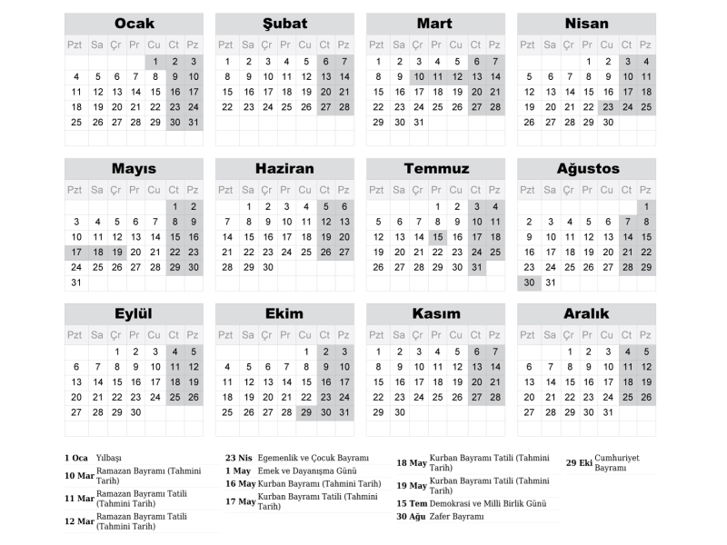
2027 Takvimi İndir: PDF & AI Format (CMYK Baskı Uyumlu)
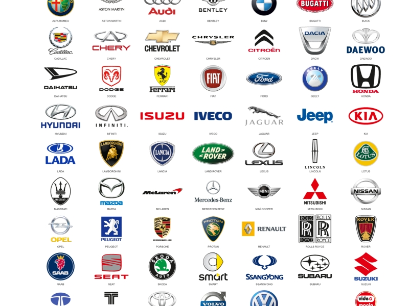
Araba Logoları: Tüm Araç Markaları Logo Koleksiyonu
Akcan Metal: Lazer Kesim ve Büküm Hizmetleri

Dilde Bıldırcın Karaman: Lezzetli Bıldırcın Ürünleri
