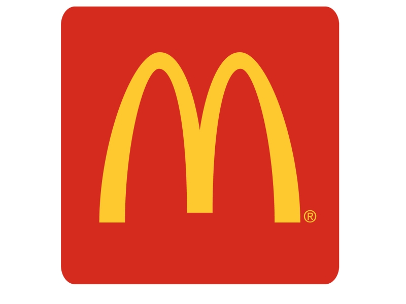
McDonalds Logo
McDonalds Logo PNG vector in SVG, PDF, AI,vectors format
Absolutely! Here's an analysis of the McDonald's logo in English:
A Brief History
The McDonald's logo, known as the Golden Arches, is one of the most recognized logos worldwide. It originated from two golden arches that flanked the sides of early McDonald's restaurants. These arches were initially designed in 1953 by architect Stanley Clark Meston. In the 1960s, the company sought a new logo and tasked designer Jim Schindler with the project. Schindler connected the two arches, creating the now-iconic "M."
Meaning and Symbolism
The McDonald's logo was designed to be simple, memorable, and easily recognizable from a distance.
Golden Color: The gold or yellow color represents wealth, prosperity, and happiness. It's also a color that is easily visible, even from far away, attracting attention from motorists.
The Arches: Initially, the arches were a literal part of the restaurant's architecture. Symbolically, they can represent:
The McDonald Brothers: The founders of the company.
"M" for McDonald's: The most obvious interpretation, reinforcing brand recognition.
A Gateway: Suggesting an entrance to a place of affordable and convenient food.
Simplicity: The clean, uncluttered design makes it easy to reproduce and remember.
Success and Impact
The McDonald's logo is a resounding success due to its simplicity and memorability. It's recognized virtually everywhere and strongly associated with the brand. It's also effectively used in advertising and marketing materials. Its consistency over time has built a strong brand identity.
Criticism and Considerations
While widely successful, the logo has faced some minor criticisms:
Over-Simplicity: Some critics find it too basic and generic. However, its simplicity is also its strength, especially for appealing to a broad audience, including children and families.
Health Concerns: Given McDonald's association with fast food, the logo is sometimes linked to negative perceptions about unhealthy diets. However, this is more of a reflection of the product than the logo itself.
Color Psychology
The use of red and yellow in McDonald's branding (and often as a background to the golden arches) is also strategic:
Red: Associated with excitement, energy, and appetite. It's meant to stimulate and attract attention.
Yellow: Linked to happiness, optimism, and visibility. It's one of the most visible colors in daylight, making the logo easy to spot.
Variations and Evolution
While the core "M" has remained consistent, there have been minor variations over time:
Backgrounds: Sometimes the "M" appears on a red background, sometimes on a white one.
Green Backgrounds in Europe: In some European countries, McDonald's has used a green background to emphasize environmental consciousness.
The Future
The McDonald's logo is likely to remain a core part of the company's identity for the foreseeable future. While minor updates might occur, the basic design is so ingrained in global culture that significant changes are unlikely.
In summary, the McDonald's logo is a masterclass in branding. Its simplicity, strategic use of color, and strong symbolism have made it one of the most recognizable and successful logos in the world.
Recommended for you
Karabulut Metal

2027 Takvimi İndir: PDF & AI Format (CMYK Baskı Uyumlu)
Araba Logoları: Tüm Araç Markaları Logo Koleksiyonu
Akcan Metal: Lazer Kesim ve Büküm Hizmetleri

Dilde Bıldırcın Karaman: Lezzetli Bıldırcın Ürünleri
Aslan Danışmanlık: İsa Başer ile İşletme Danışmanlığı
Ege Elektrik Aydın Ören: Bobinaj ve Motor Tamiri

Gazi Sondaj Gaziantep: Kuyu Kazı ve Sondaj Hizmetleri
Jet Lazer Metal: Lazer Kesim ve Metal İmalat Hizmetleri
Hazel Grup Elektromekanik: Lazer Kesim ve Metal İşleme
Deveciler Metal: Sac İşleme ve Lazer Kesim Hizmetleri
