Ikea Logo
Ikea Logo PNG vector in SVG, PDF, AI,vectors format
Simplicity and Recognizability: The IKEA logo is known for its extreme simplicity. It consists of the word "IKEA" in bold, sans-serif, uppercase letters, enclosed within a yellow rectangle with rounded corners. This simplicity makes it instantly recognizable and easily reproducible, crucial for a global brand.
Color Palette and National Identity: The use of yellow and blue is significant. These are the colors of the Swedish flag, reflecting the company's Swedish origins and heritage. This reinforces the brand's identity and association with Swedish design principles, which are often perceived as functional, minimalist, and affordable.
Typography: The typeface used for "IKEA" is a custom-designed, bold, sans-serif font. It's clean, blocky, and easily legible, contributing to the logo's overall simplicity and clarity. The boldness of the font conveys a sense of stability and reliability.
Shape and Framing: The yellow rectangle with rounded corners acts as a frame for the wordmark. The rounded corners soften the overall look and feel, making it slightly more approachable and less harsh than sharp corners would. The rectangle provides a clear and contained space for the brand name, ensuring its prominence.
Consistency and Longevity: The IKEA logo has remained remarkably consistent over time. While there have been minor tweaks and refinements, the core elements—the yellow rectangle, the blue lettering, and the simple typography—have remained unchanged for decades. This consistency has contributed to the logo's strong brand recognition and enduring appeal.
Association with Value and Affordability: The logo's simplicity and the use of bright, primary colors contribute to its association with value and affordability. It conveys the message that IKEA offers functional and well-designed products at accessible prices.
Cultural Impact: The IKEA logo has become a global icon, instantly recognizable in almost every corner of the world. It represents not only a furniture retailer but also a certain lifestyle and design aesthetic.
In summary, the IKEA logo's success can be attributed to its simplicity, its strong association with Swedish identity, its clear and legible typography, and its consistent use over time. These elements work together to create a powerful and recognizable brand identity that communicates value, affordability, and functional design.
Recommended for you
Özkal Makine
Fema Teknik Lazer
Walmak Makine Metal Sanayi
Akdenizler Lazer Kesim
Yeşil Makina Logo
Özdemir Demir Doğrama
Karabulut Metal
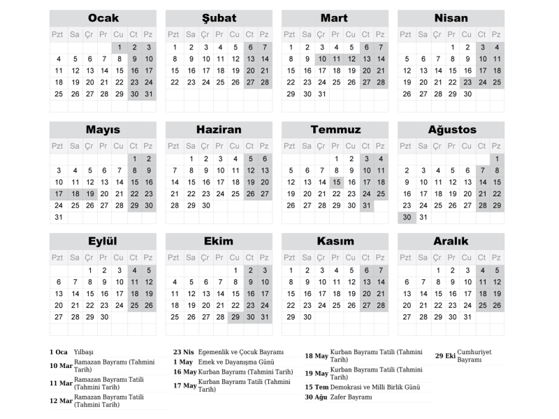
2027 Takvimi İndir: PDF & AI Format (CMYK Baskı Uyumlu)
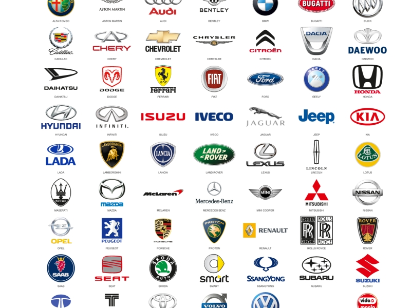
Araba Logoları: Tüm Araç Markaları Logo Koleksiyonu
Akcan Metal: Lazer Kesim ve Büküm Hizmetleri

Dilde Bıldırcın Karaman: Lezzetli Bıldırcın Ürünleri
