Dunkin Donuts Logo
Dunkin Donuts Logo PNG vector in SVG, PDF, AI,vectors format
The Dunkin' Logo: A Symbol of Coffee and Donuts
The Dunkin' logo, known for its bright orange and pink colors, is instantly recognizable and associated with coffee and donuts. The logo has evolved over time, but the core elements—bright colors and a focus on the brand name—have remained consistent.
Here's a brief overview of the logo's evolution:
Early Years (1950s-1960s): The initial logos featured a more handwritten, script-style font in dark red. These early designs were quite different from the cheerful and bold logo we know today.
Introduction of Pink and Orange (1960s-Present): The iconic pink and orange colors were introduced in the 1960s. These colors are believed to represent the colors of coffee and a powdered donut. A stylized coffee cup with the company name encircling it was also introduced.
The "DD" Era (1970s-2000s): The "DD" abbreviation within the coffee cup became a prominent feature, further simplifying and strengthening the brand recognition.
Modernization (2000s-Present): In the 2000s, the logo was modernized, with a bolder, sans-serif font and a cleaner design. The full name "Dunkin' Donuts" was used, later shortened to just "Dunkin'" in 2018. This change reflected the company's broader focus beyond just donuts to include a wider range of beverages and breakfast items.
The current Dunkin' logo is simple, bold, and easily recognizable. The bright colors and distinctive font make it stand out in a crowded market.
Company Origin: United States
Website Category: Coffee Shop, Fast Food, Donuts, Bakery
Keywords: Dunkin', Dunkin' Donuts, logo, coffee, donuts, bakery, fast food, orange, pink, DD, United States, beverage, breakfast
Recommended for you
Özdemir Demir Doğrama
Karabulut Metal
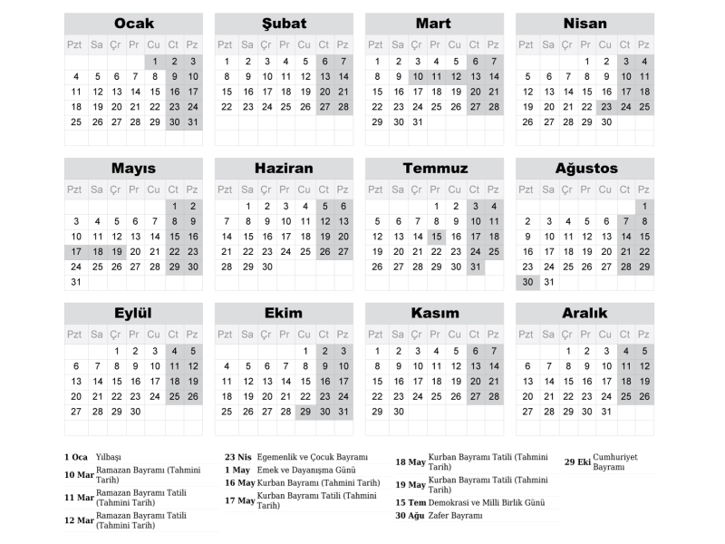
2027 Takvimi İndir: PDF & AI Format (CMYK Baskı Uyumlu)
Araba Logoları: Tüm Araç Markaları Logo Koleksiyonu
Akcan Metal: Lazer Kesim ve Büküm Hizmetleri

Dilde Bıldırcın Karaman: Lezzetli Bıldırcın Ürünleri
Aslan Danışmanlık: İsa Başer ile İşletme Danışmanlığı
Ege Elektrik Aydın Ören: Bobinaj ve Motor Tamiri

Gazi Sondaj Gaziantep: Kuyu Kazı ve Sondaj Hizmetleri

Jet Lazer Metal: Lazer Kesim ve Metal İmalat Hizmetleri

Hazel Grup Elektromekanik: Lazer Kesim ve Metal İşleme
