Decathlon Logo
Decathlon Logo PNG vector in SVG, PDF, AI,vectors format
The Decathlon Logo: A Symbol of Sport for All
The Decathlon logo has recently undergone a significant redesign, moving away from its previous wordmark-focused design to a more symbolic and dynamic visual identity. The new logo, introduced in 2024, features a stylized symbol known as "l'Orbit" (the Orbit).
This "Orbit" symbol is a dynamic, curved shape that represents movement, momentum, and the pursuit of new heights. It also subtly suggests a loop or cycle, symbolizing sustainability and the cyclical nature of sports and activity. The symbol is often paired with the word "Decathlon" in a custom-designed sans-serif typeface called "Decathlon Sans."
The previous Decathlon logo primarily featured the company name in a bold, sans-serif font. While recognizable, it lacked a distinct visual symbol. The new logo aims to create a more memorable and iconic brand identity that reflects Decathlon's mission of making sports accessible to everyone. The blue color used in the logo represents trust, stability, and accessibility.
Key Words: Decathlon, logo, redesign, l'Orbit, sport, sports equipment, retail, design, branding, athletic, movement, sustainability, Decathlon Sans, Wolff Olins
Country of Origin: France
Website Category/Industry: Sporting Goods Retail, E-commerce, Sports Equipment Manufacturing, Retail
Recommended for you
Özkal Makine
Fema Teknik Lazer
Walmak Makine Metal Sanayi
Akdenizler Lazer Kesim
Yeşil Makina Logo
Özdemir Demir Doğrama
Karabulut Metal
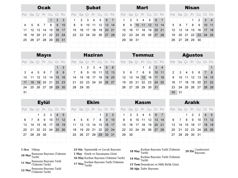
2027 Takvimi İndir: PDF & AI Format (CMYK Baskı Uyumlu)
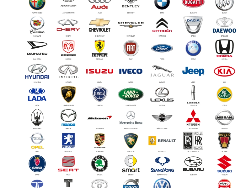
Araba Logoları: Tüm Araç Markaları Logo Koleksiyonu
Akcan Metal: Lazer Kesim ve Büküm Hizmetleri

Dilde Bıldırcın Karaman: Lezzetli Bıldırcın Ürünleri
