Carrefour Logo
Carrefour Logo PNG vector in SVG, PDF, AI,vectors format
Carrefour Logo: A Hidden "C" Symbolizing Crossroads
The Carrefour logo is a clever and distinctive design that subtly incorporates the letter "C" within its imagery. The logo features two opposing arrows, one red and one blue, pointing in opposite directions. The negative space created between these arrows forms the shape of a "C," which stands for Carrefour (meaning "crossroads" in French). This design effectively symbolizes the company's role as a meeting point for consumers and products. The red and blue colors are vibrant and eye-catching, contributing to the logo's strong brand recognition. This simple yet ingenious use of negative space has made the Carrefour logo one of the most recognizable in the retail industry worldwide.
Additional Information:
Company/Organization: Carrefour S.A.
Country of Origin: France
Website Category/Industry: Retail, Supermarkets, Hypermarkets, Grocery, E-commerce
Keywords: Carrefour, logo, retail, supermarket, hypermarket, grocery, e-commerce, France, C logo, negative space, arrows, red and blue, brand identity.
Recommended for you
Karabulut Metal
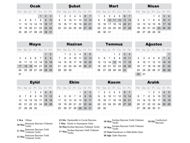
2027 Takvimi İndir: PDF & AI Format (CMYK Baskı Uyumlu)
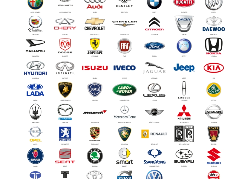
Araba Logoları: Tüm Araç Markaları Logo Koleksiyonu
Akcan Metal: Lazer Kesim ve Büküm Hizmetleri

Dilde Bıldırcın Karaman: Lezzetli Bıldırcın Ürünleri
Aslan Danışmanlık: İsa Başer ile İşletme Danışmanlığı
Ege Elektrik Aydın Ören: Bobinaj ve Motor Tamiri

Gazi Sondaj Gaziantep: Kuyu Kazı ve Sondaj Hizmetleri

Jet Lazer Metal: Lazer Kesim ve Metal İmalat Hizmetleri
Hazel Grup Elektromekanik: Lazer Kesim ve Metal İşleme
Deveciler Metal: Sac İşleme ve Lazer Kesim Hizmetleri
