Burger King Logo
Burger King Logo PNG vector in SVG, PDF, AI,vectors format
The Burger King Logo: A History of Buns and Branding
The Burger King logo has a long and interesting history, evolving significantly over the decades. The core concept has generally revolved around depicting a burger, buns, or the company name in a distinctive and memorable way.
Here's a brief overview of the logo's evolution:
Early Years (1950s-1960s): Initial logos featured a more literal depiction of a king sitting on a burger. These early designs were quite different from the more abstract and streamlined logos that followed.
The "Bun" Logo (1969-1999): This is perhaps the most iconic Burger King logo, featuring the company name sandwiched between two stylized buns. This design was simple, memorable, and directly communicated the company's core product: burgers. This logo had several variations over the years, including changes to the font and the addition of a blue circle around the buns.
The Blue Circle Era (1994-1999): A variation of the "bun" logo which added a blue circle around the buns.
The "Swish" Logo (1999-2021): This logo retained the "Burger King" name within the buns but added a blue "swish" or curve underneath. This was intended to add a sense of dynamism and modernity.
Return to the "Bun" Logo (2021-Present): In 2021, Burger King underwent a significant rebranding, returning to a modernized version of the classic "bun" logo from 1969. This retro-inspired design removed the blue swish and opted for a simpler, more vintage look. The new logo uses a custom typeface called "Flame," reminiscent of the Cooper Black font, giving it a warm and inviting feel.
The current Burger King logo is a clear attempt to evoke nostalgia and emphasize the brand's heritage while also appearing fresh and modern.
Company Origin: United States
Website Category: Fast Food, Restaurants, Burgers
Keywords: Burger King, logo, burger, bun, fast food, restaurant, BK, Flame, United States, branding, retro, design
Recommended for you

Karabulut Metal
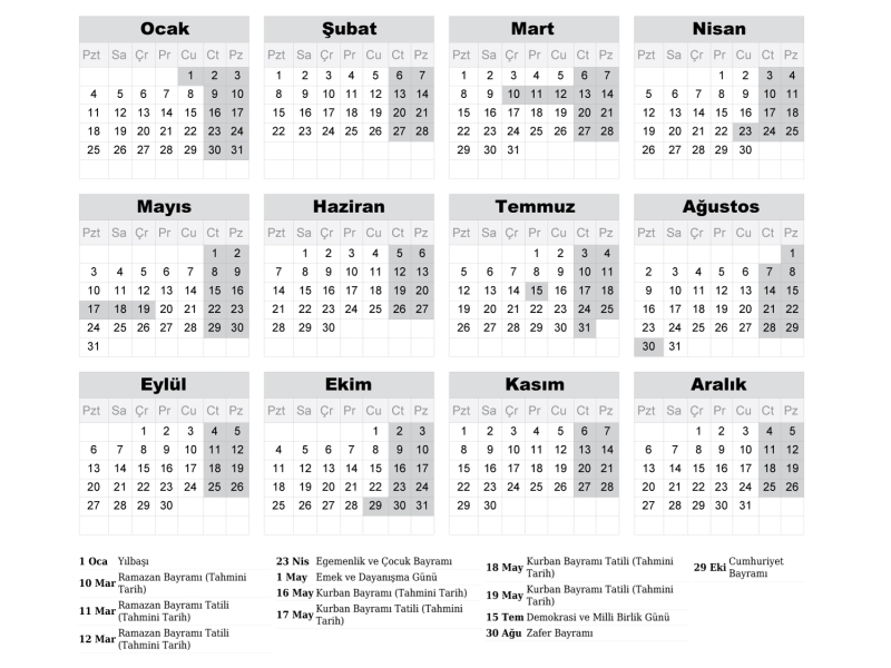
2027 Takvimi İndir: PDF & AI Format (CMYK Baskı Uyumlu)
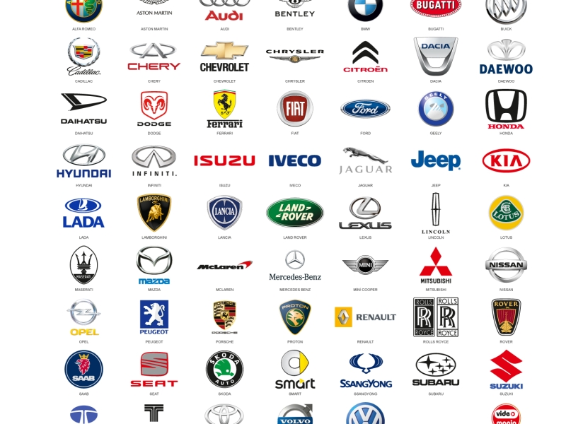
Araba Logoları: Tüm Araç Markaları Logo Koleksiyonu
Akcan Metal: Lazer Kesim ve Büküm Hizmetleri

Dilde Bıldırcın Karaman: Lezzetli Bıldırcın Ürünleri
Aslan Danışmanlık: İsa Başer ile İşletme Danışmanlığı
Ege Elektrik Aydın Ören: Bobinaj ve Motor Tamiri

Gazi Sondaj Gaziantep: Kuyu Kazı ve Sondaj Hizmetleri

Jet Lazer Metal: Lazer Kesim ve Metal İmalat Hizmetleri

Hazel Grup Elektromekanik: Lazer Kesim ve Metal İşleme
Deveciler Metal: Sac İşleme ve Lazer Kesim Hizmetleri
